
Millennium is one of Portugal’s leading financial institutions, offering a wide range of banking and financial services to individuals, businesses, and corporate clients. As a key player in the banking sector, Millennium is known for its commitment to digital innovation, continuously improving its online and mobile banking experiences to meet evolving customer needs.
Context
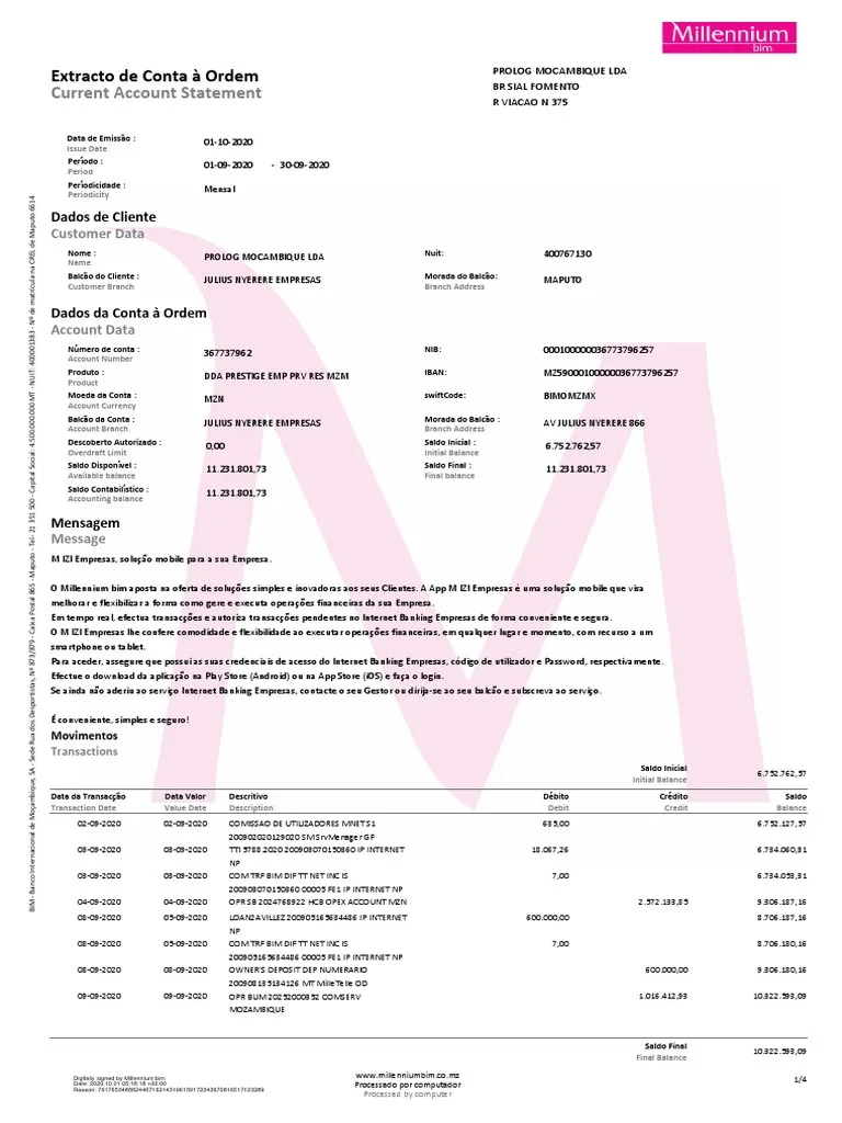
In the financial sector, invoices are a crucial touchpoint between banks and their customers. However, the bank’s existing paper invoice was difficult to read, had issues with information handling, and lacked clarity in structure. Customers frequently contacted support for clarifications, resulting in increased operational costs. This project was an opportunity to improve the user experience and leverage digital transformation by designing an interactive invoice that could be more intuitive and efficient.
Our team was already a pioneer in interactive invoices in Portugal, having won Gold in M&P’s Digital category (2017) for a previous project. This experience positioned us uniquely to tackle this challenge and set a new benchmark for financial document design.
Responsibilities
1
Identifying user pain points with the existing paper invoice. Customers found it overwhelming due to poor information hierarchy, small fonts, and a cluttered layout, leading to confusion and unnecessary calls to customer support.
2
Collaborating across multiple departments (Finance, Customer Service, Compliance, and Digital Banking) to redefine the invoice’s information architecture while ensuring it met regulatory requirements.
3
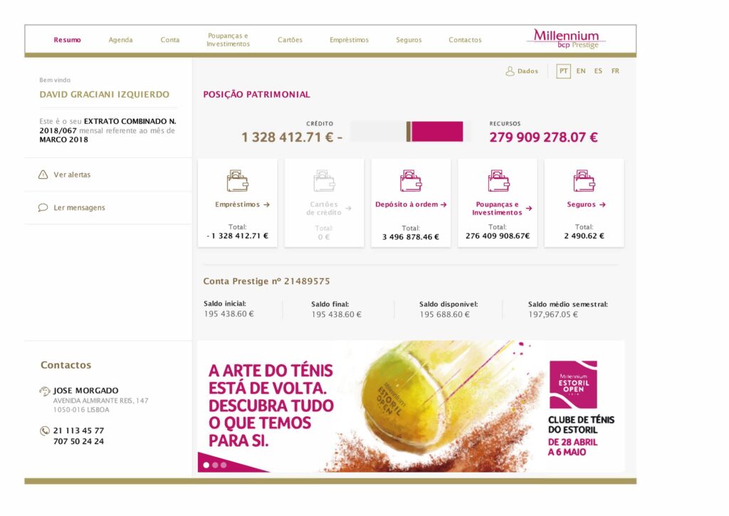
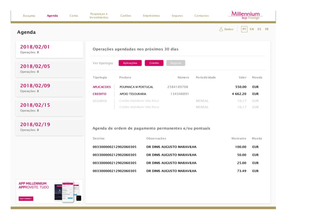
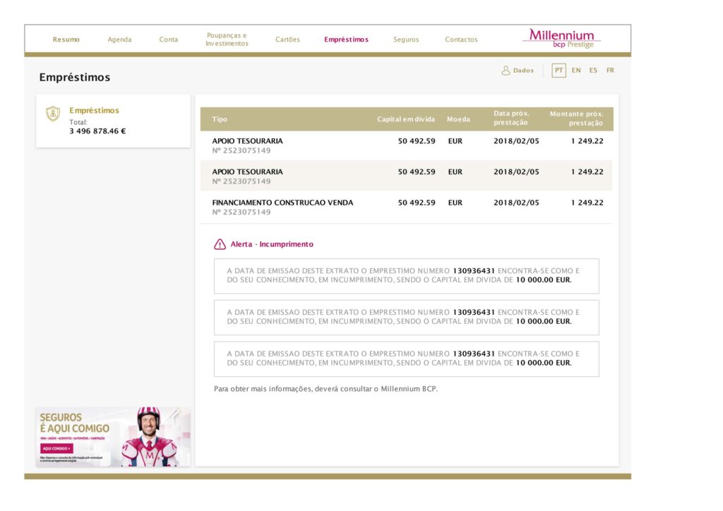
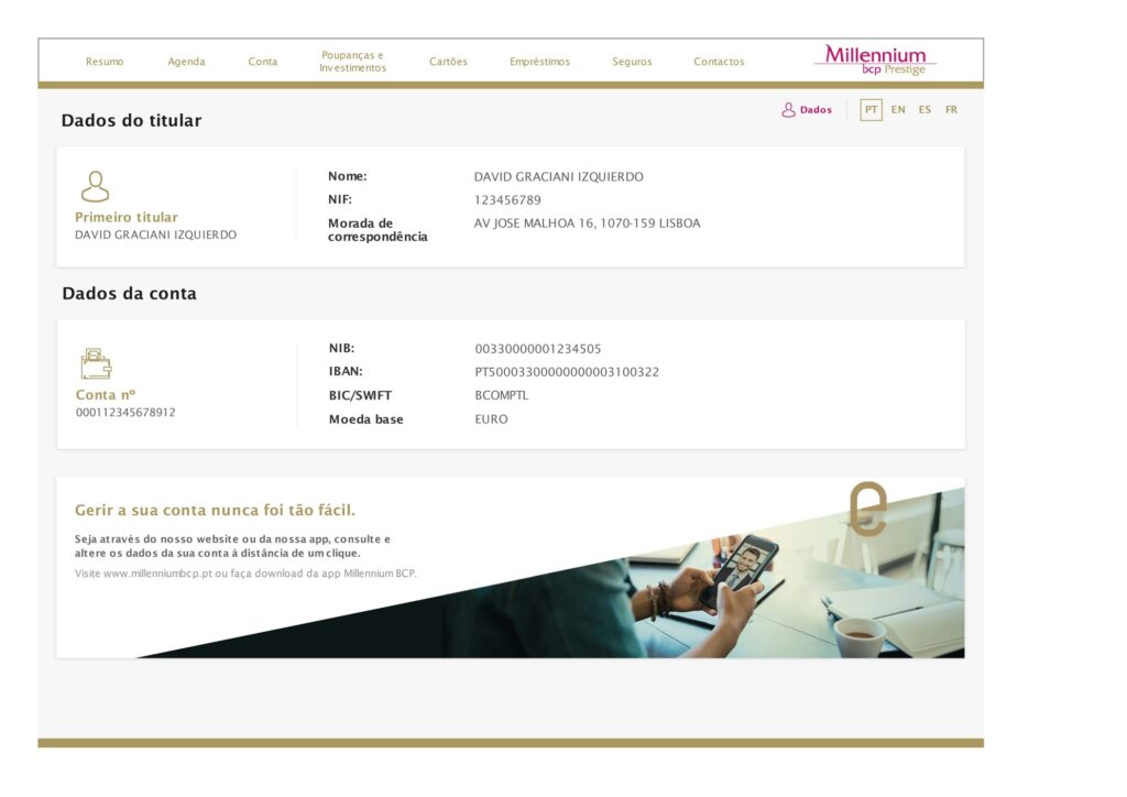
Designing a fully digital invoice that could accommodate subpages and interactive elements, allowing users to explore detailed breakdowns, payment options, and transaction histories seamlessly.
Research & Discovery
We began with a comprehensive research phase to ensure our design was data-driven.
To assess the existing paper invoice, we conducted a heuristic evaluation based on Jakob Nielsen’s usability principles. We identified several critical usability issues:
Poor information architecture:
Confusing Terminology & Financial Jargon:
Lack of Visual Clarity & Readability Issues:
No Actionable Elements
To validate our heuristic findings, we conducted a survey for a small sample of existing customers and internal stakeholder discussions.
“I had to call support multiple times to have my invoice explained to me because it’s too complex for me to read.”
“I always check three times before paying because I don’t trust that I’ve read the correct amount.”
“I wish I could just click to pay instead of manually typing everything into Millennium’s app.”
Customer Service Team: Reduce the volume of invoice-related inquiries.
Compliance & Legal: Ensure transparency while maintaining regulatory standards.
Finance & Product Teams: Encourage faster payments and reduce missed due dates.
Key takeaway: All teams agreed that a digital, interactive invoice could significantly improve usability and customer satisfaction—while reducing operational costs.
To ensure our solution was not just an improvement but a best-in-class experience, we analyzed digital invoices and statements from modern fintech companies like Revolut, Wise, N26, and Nubank.
Revolut
Clean, minimalist UI with clear transaction details.
Lacked deep invoice breakdown and contextual tooltips.
N26
Intuitive navigation and one-tap payments.
Could improve the hierarchy of due dates & amounts.
Nubank
Excellent use of color and typography to highlight key information.
Too much reliance on visuals over text.
Design Workshop
To align all stakeholders, we facilitated a two-part design workshop involving representatives from Finance, Customer Service, Legal, and Digital teams:
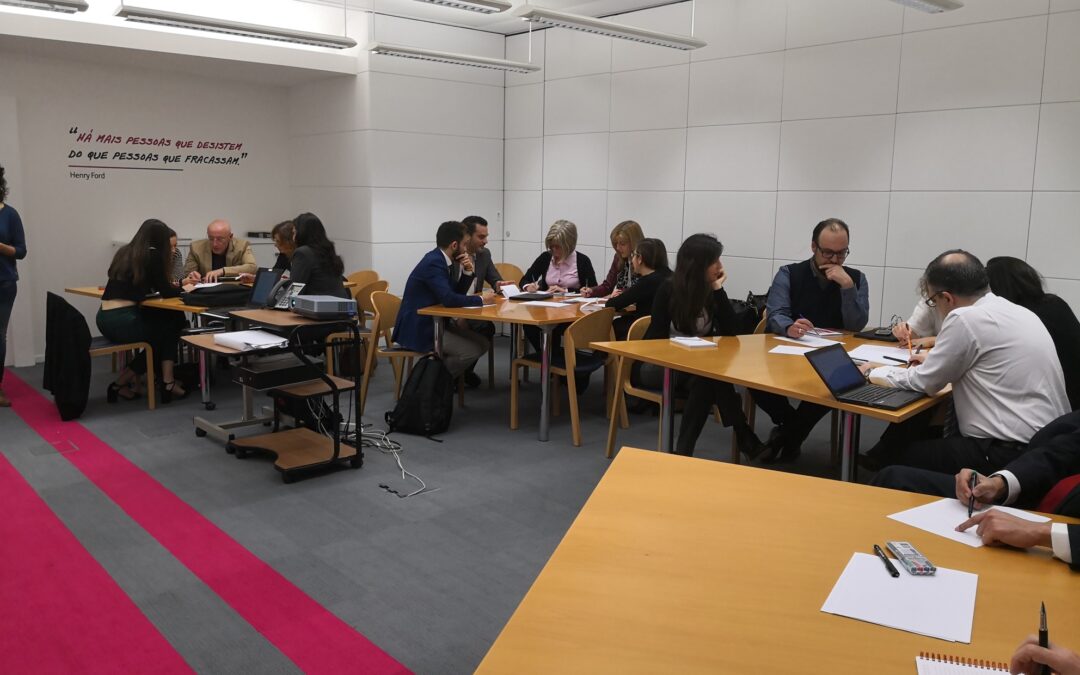
Stakeholders were divided into four groups and asked to reorganize the invoice’s content based on logical grouping and priority levels. Each group then sketched a rough layout for the new invoice and presented their ideas. Based on these, I worked on two different mockups to be evaluated on a second session.
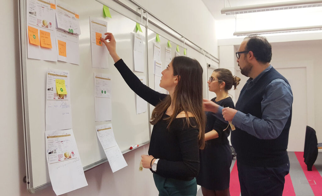
In the second part of the workshop, our objective was to refine the group proposals and define a Minimum Viable Product (MVP) version of the interactive invoice.
We developed two slightly different information architectures, each prioritizing key content in distinct ways. Using these structures as a foundation, we created multiple design proposals for the main pages—focusing on the areas that groups had identified as most relevant to customers.
Participants were encouraged to sketch layouts, use post-its, or provide direct feedback on existing drafts. As they shared insights and voted on the strongest ideas, we synthesized the top concepts into a clear direction, setting the stage for the high-fidelity mockups.
User Testing & Validation
To validate the new invoice’s usability, we conducted a series of user tests with a sample of 6 participants:
Think-Aloud
Eye-tracking
Task-based
Conclusion
The final solution transformed the invoice from a static, hard-to-read document into a dynamic, user-friendly experience. Key features included:
Learnings