Endesa
During the company’s repositioning in the portuguese market I was hired by a Consultancy company (CGI) to be part of a team of two designers responsible for redesigning their online platform, which included UX (information architecture, wireframing, prototyping), UI (high-fidelity mockups, defining a visual language for the brand’s online channels) and User Research.
the client
Endesa is a prominent energy company with a significant presence in Portugal. As a key player in the energy sector, it provides electricity and natural gas solutions to residential, commercial, and industrial customers across the country.
Discovery and research
Following the kickoff sessions and gathering the requirements, the team conducted a comprehensive review of the website. Analyzing the existing analytics, it became evident that the conversion rate was remarkably low. Customers were navigating through peculiar paths, and even when they managed to find the Call-to-Action (CTA) buttons, they frequently abandoned the sales flow before completing the desired actions.
services
• Competitor Analysis;
• Analytics Review;
• Information Architecture (IA): assessment, redesign and tree test preparation;
• Wireframing and prototyping;
• Usability testing: preparation, moderation and analysis.
New ia and first contact with customers
During the initial activities with Endesa’s users, I conducted two online tree tests with customers. In the first test, I presented the old Information Architecture, to evaluate the information architecture of the current website and identify areas for improvement, providing a guideline for making changes to a new information architecture. In the second test, I introduced the new Information Architecture. The findings from these tests revealed that:
• A high incidence of ‘deceptive’ tasks – 56% – low success rate in completing these tasks, but users are very confident in their success.
• 90% Tasks related to potential customer inquiries, searching for contacts and industry information, as well as searching for contractual documentation, are the ones that most need improvements.
• The labeling of menu options sometimes creates difficulties in interpreting what these topics are and what can be found after selecting each option.
• The label “Products” in the 1st test and “Services” in the 2nd test in the context of Endesa’s offerings is not clear enough.
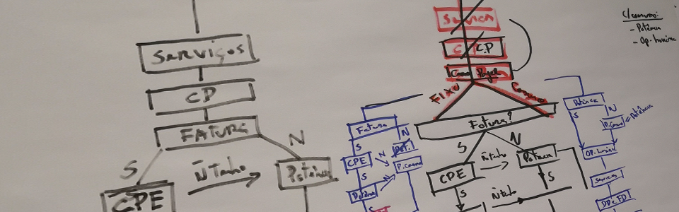
first drafts of a new information architecture and a reformed sales flow
Sketching and testing
After gathering those findings, we proceeded to create low-fidelity mockups with the second iteration of the Information Architecture (IA) already implemented. We conducted an initial usability test to evaluate simple tasks such as finding electric (and combined) products and completing the hiring process. Subsequently, we conducted an A/B testing to assess a new color palette and how users perceived electric, gas, and combined products, and to determine which colors they associated with each option.
For these tests, we employed the Eye-tracking + Think Aloud methodology. I took the responsibility of preparing the test scripts and prototypes. Additionally, I conducted and moderated half of the testing sessions (6 participants), the other half was done by the UX lead. Subsequently, I compiled all the data and insights gathered from the tests and prepared the report summarizing the findings and recommendations.
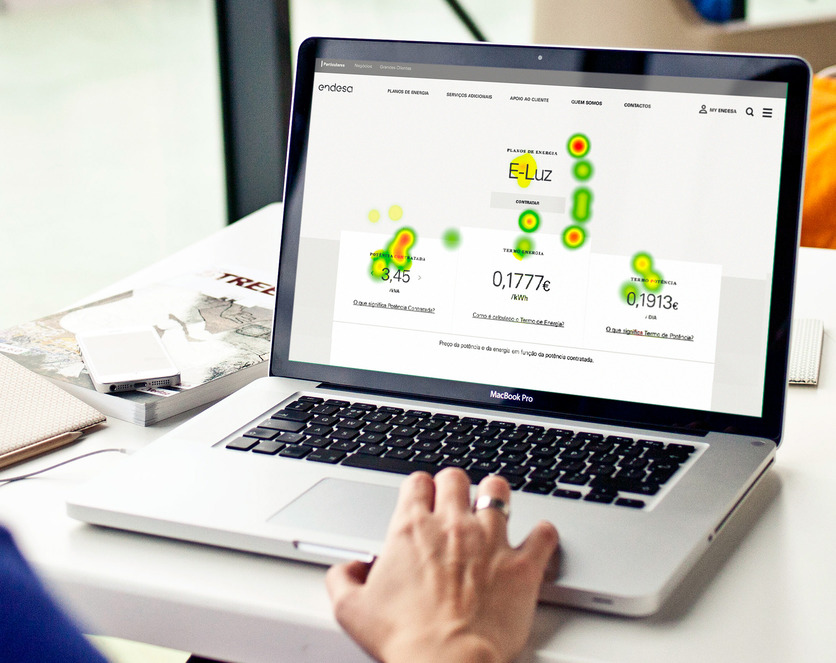
Heatmap of Endesa's electricity portfolio
Definition and validation
In the second phase of the project, we set our sights on creating a Minimum Viable Product (MVP). Building on the positive results from the initial low-fidelity iteration, we moved forward to enhance and refine the product pages and sales flow while also focusing on designing the remaining content pages.
Responsibilities
• High-fidelity mockups;
• Wireframing and prototyping;
• Usability testing: preparation, moderation and analysis.
designing on top of our findings
During testing across different project phases, we uncovered valuable insights that guided the product’s development, tailored to our users’ needs.
Working in the energy sector presented a unique challenge as many people struggled to grasp the industry-specific terminology commonly used by energy companies.
Participants wished for:
– Smaller elements and more information per screen;
– Easily associate between content and color;
– Be able to send meter readings easily;
– See the real value that they would have to pay at the end of the month (and not an estimate);
– Have a page on the website that could explain the invoice details.
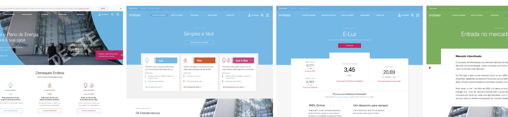
high-fidelity of endesa's mainpages
Eye-tracking time
For the second usability test, I’ve incorporated eye-tracking technology to gain deeper insights into Endesa’s sales flow. This time, I wanted to focus on evaluating the user experience of both the website and the form.
To ensure comprehensive results, I divided the sample into two groups and conducted testing for both the Desktop and Mobile versions of the platform. This approach allowed to assess the usability and efficiency of the sales flow across different devices and screen sizes.
+ Participants expressed their appreciation for the ease with which they could find information on Endesa’s website.
+ The consistency observed across pages, hubs, and content facilitated quick association and enabled users to find the information they were seeking without any confusion.
+ Users commended the accessibility and user-friendliness of the Energy Plan Simulator, making it easy for them to access and use the tool.
– Users expressed a preference for non-technical language and showed disinterest in encountering complex technical information, even if it was legally required.
– Users faced challenges in comprehending the information presented within the Electricity+Gas page, indicating a need for improved clarity and user-friendly content.
– Notably, none of the users successfully completed the Contract Form, highlighting critical usability issues that demand immediate attention and optimization.

Retouching and delivering
+ In the plan page, proposed a way for users to see the final price by picking the desired electricity voltage;
+ Every plan page was redesigned to have the same template, whether it was electricity or electricity + gas;
+ Reformulated the Contract form, kept it scroll-less and got rid of enumerous bugs that were frustrating users;
+ Replace the plan configurator (static content) by a plan simulator (dynamic content).
What we’ve achieved
One way street
Endesa reduced the number of landing pages available for commercial purposes and began centralising their content in the main website
We welcome visitors
Number of dropout sessions decreased by 32% and the time that users spent on
the website increased every month since mid-2017 (source: Google Analytics)
Taking the lead
ENEL Italy and ENEL Spain redesigned their websites based on our templating logic, re-using some of our components.